SPACE
시선 時鮮
김세직 Kim SejikKim SejikKim Sejik
 sejik0310@naver.com
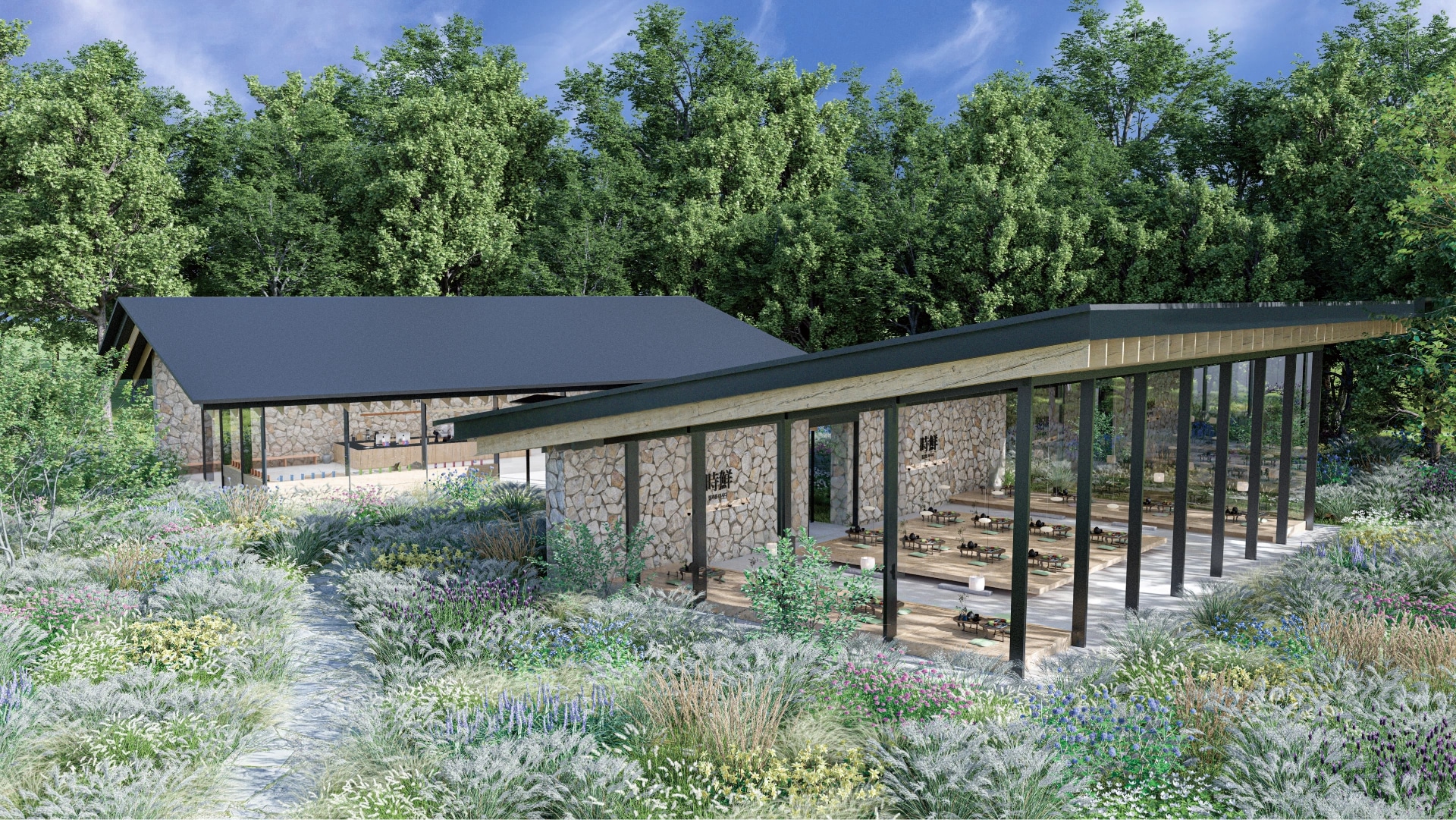
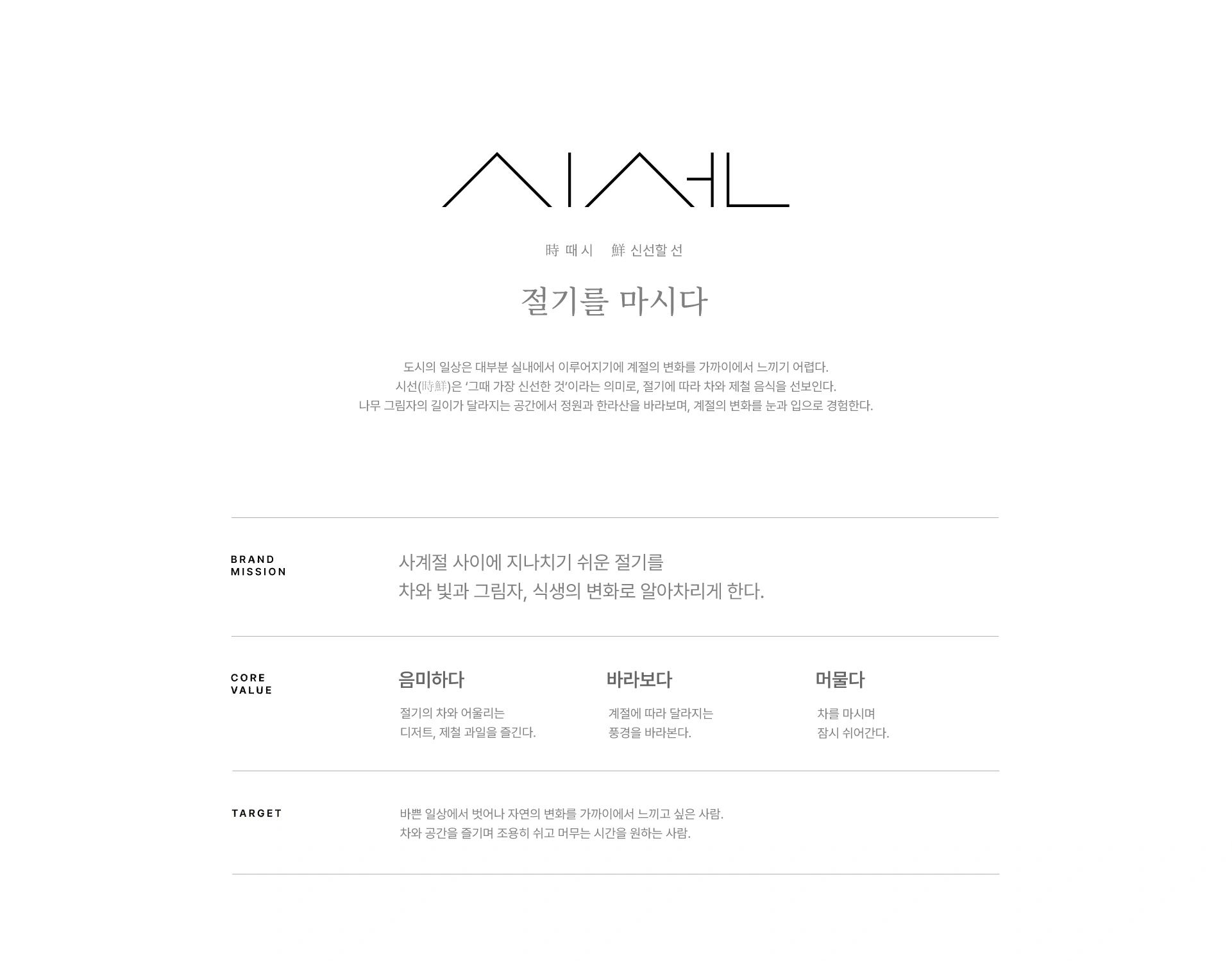
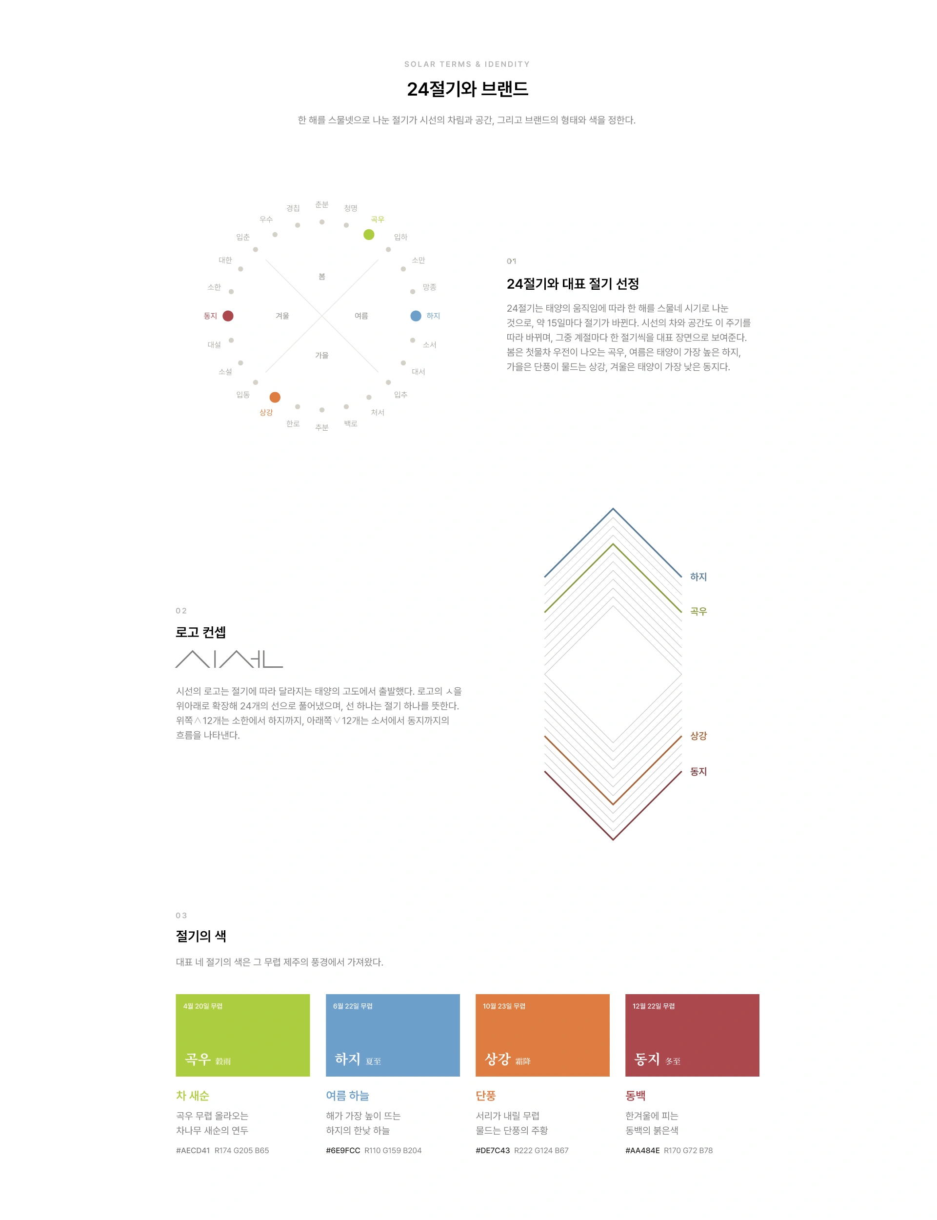
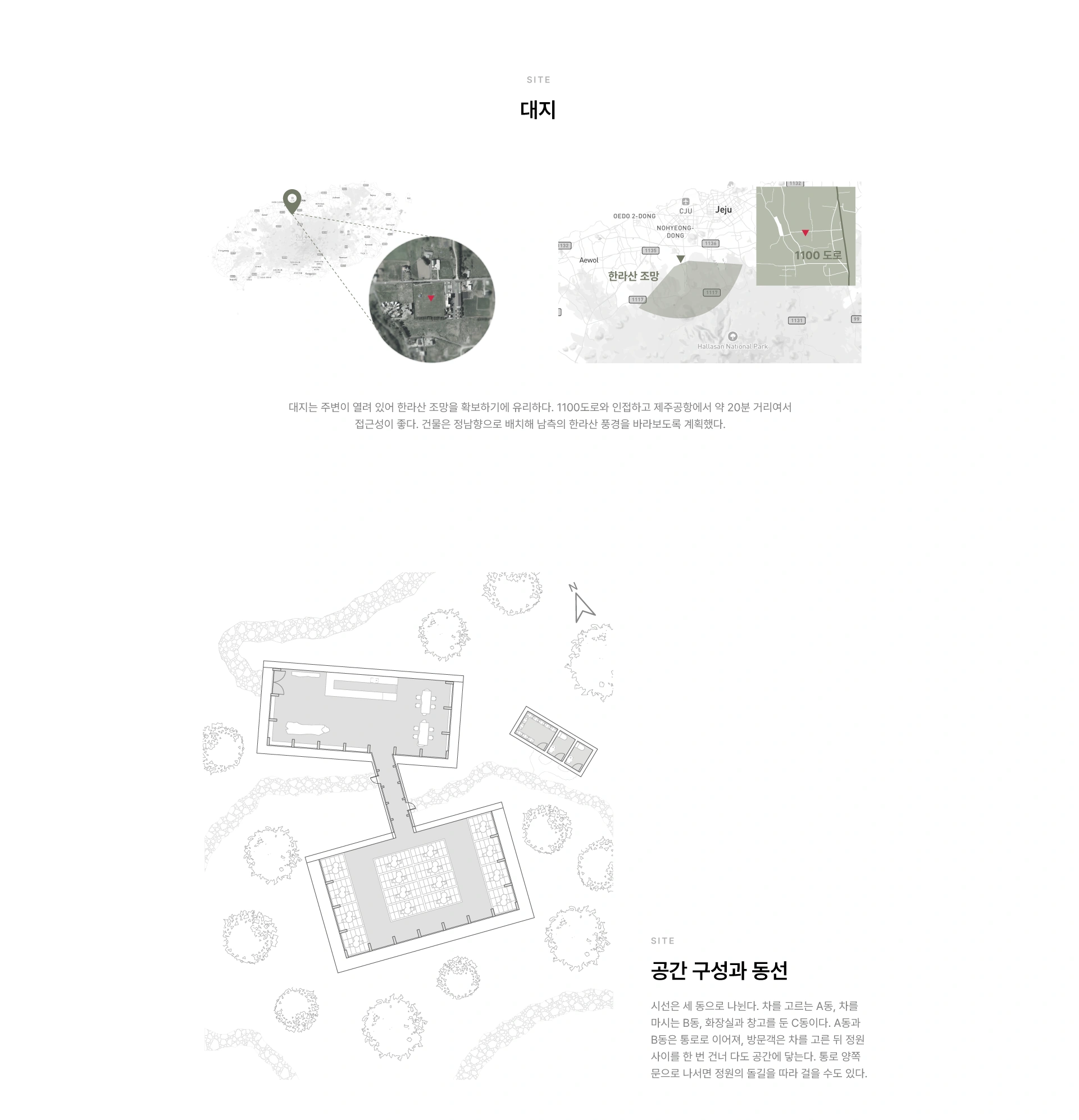
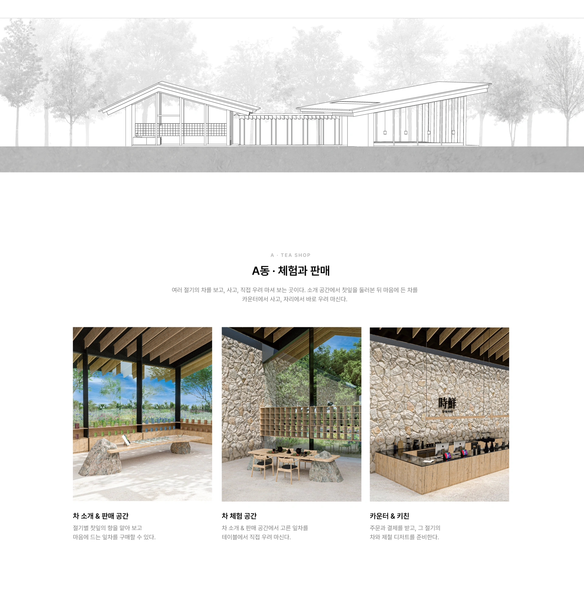
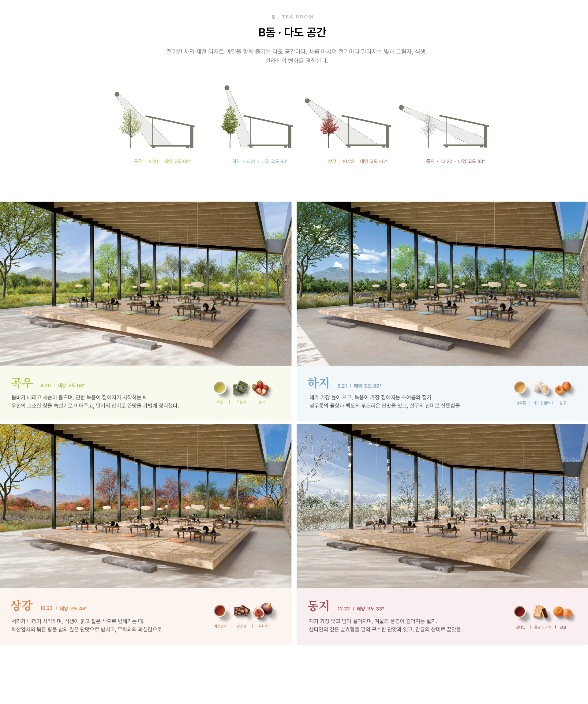
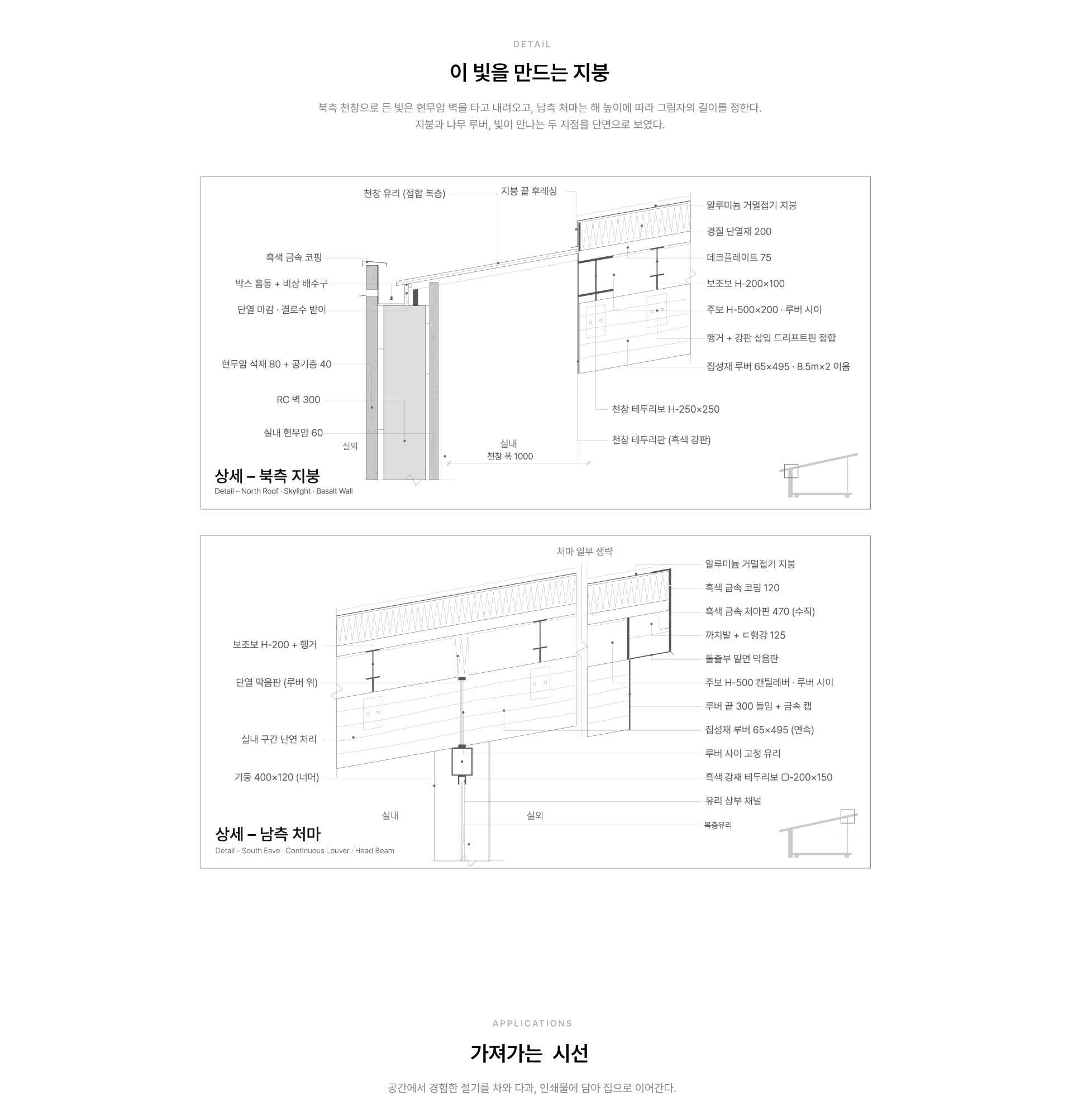
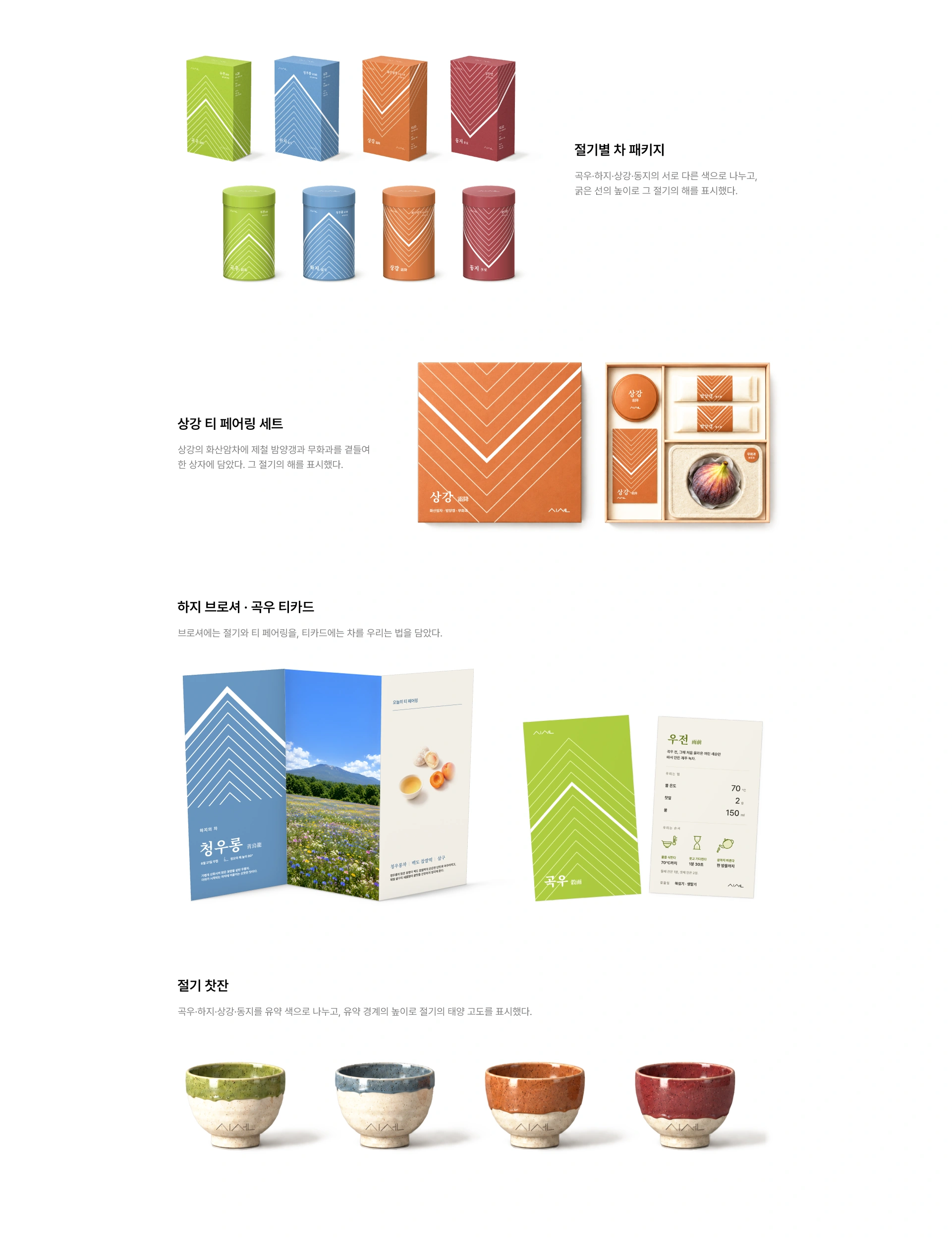
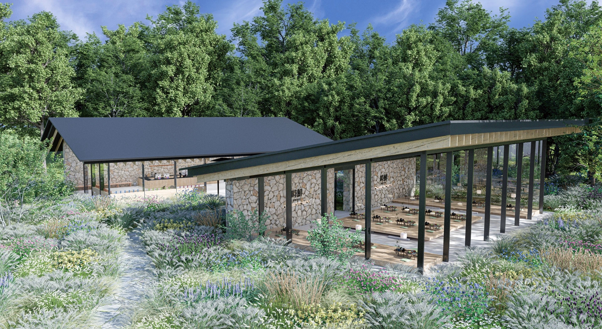
도시의 일상은 대부분 실내에서 이루어져 계절의 변화가 가까이 있어도 그 모습을 온전히 느끼기 어렵습니다. 시선(時鮮)은 때를 뜻하는 시(時)와 신선함을 뜻하는 선(鮮)을 합친 이름으로, ‘절기를 마시다’라는 슬로건 아래 한 해를 스물네 번의 때로 나눈 절기를 따라 그 절기에 어울리는 차와 디저트, 과일을 페어링하는 제주의 다도 공간입니다. 공간은 한라산을 바라보도록 남쪽으로 열고, 절기마다 달라지는 태양의 각도를 반영해 처마 아래 빛과 그림자의 길이가 달라지도록 계획했습니다. 브랜드는 태양의 고도를 24개의 선으로 풀어낸 로고와 네 절기의 색을 바탕으로 차 패키지, 찻잔, 브로셔까지 일관된 시각 언어로 확장됩니다. 방문객은 차를 마시며 창밖 식생과 한라산의 변화, 계절의 맛과 풍경을 함께 바라보고, 일상에서 지나치기 쉬운 계절의 변화를 눈과 입으로 경험합니다.
Siseon (時鮮) combines si (時), meaning time or season, with seon (鮮), meaning freshness. Under the slogan “Sip the Seasons,” Siseon is a tea space in Jeju that follows the twenty-four solar terms, pairing each period with tea, desserts, and fruit suited to that time of year. As much of urban life takes place indoors, subtle seasonal changes can easily go unnoticed. The space is oriented south toward Hallasan Mountain and designed around the changing angle of the sun, allowing the depth of sunlight and the length of shadows beneath the eaves to shift with each solar term. The brand identity also reflects this concept: the logo expresses changes in solar altitude through twenty-four lines, while colors representing four selected solar terms are extended across tea packaging, teacups, and brochures as a consistent visual language. As visitors drink tea, they experience the changing vegetation and views of Hallasan, along with the tastes and scenery of each season, through both sight and taste.